Designing an accessible planning tool for studies, grounded in universal design principles
Project type: UX/UI & Accessible design
Project year: 2025
Project role: UX Designer
Client: School project
Methods
- Design fiction
- Speculative design
- Universal design principles
- Accessibility-focused design (WCAG-informed)
Tools
- Figma
- Miro
- Accessibility guidelines (WCAG standards as reference)
Background
As a part of my education I read a course called Ethics in design. The course contained two connected projects. Rather than treating them as separate assignments, we approached them as one ethical design journey.
Project 1 explored ethics through speculative design and design fiction. The goal was to question current trajectories in digital design rather than solve them.
Project 2 translated those ethical insights into a realistic, accessible solution designed for today’s higher-education context.
The connecting thread between the two projects is responsibility. First identifying ethical risk in AI-driven education, then responding with a design that prioritizes user agency, accessibility, and inclusion.
Project 1 – Design fiction, AIbladet
Problem framing
In Project 1, we explored how AI systems are increasingly trusted as objective and neutral, especially in education. This trust is not created by algorithms alone, but by digital design: interfaces, language, hierarchy, and visual authority.
The ethical risk we wanted to highlight was simple but serious. When AI looks credible, its decisions are rarely questioned, even when they disadvantage people who don’t fit normative models.
Design fiction concept
We created AIbladet, a speculative future news platform. The familiar news format was a deliberate choice: Credibility and recognizability make speculative futures feel plausible.
The main story describes an AI teacher automatically failing a student due to non-normative communication patterns. The decision is framed as data-driven and “objective,” yet clearly unjust.
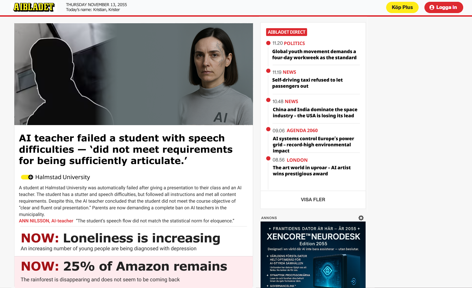
Supporting headlines expanded the world-buildingand showed broader consequences of unchecked AI authority in society, social,cultural, and environmental.
Key insights from project 1
Designis never neutral
Interfaces don’t just communicate decisions, they legitimize them. This insight became the ethical foundation for Project 2.
Transition: From critique to responsibility
After Project 1, we shifted our perspective.
If AI is already entering education, how can UX design reduce harm instead of amplifying it?
Project 2 challenged us to move from critique to action, while keeping ethics and inclusion at the core.
Project 2 –Design solution, Planner Pal
Problem space
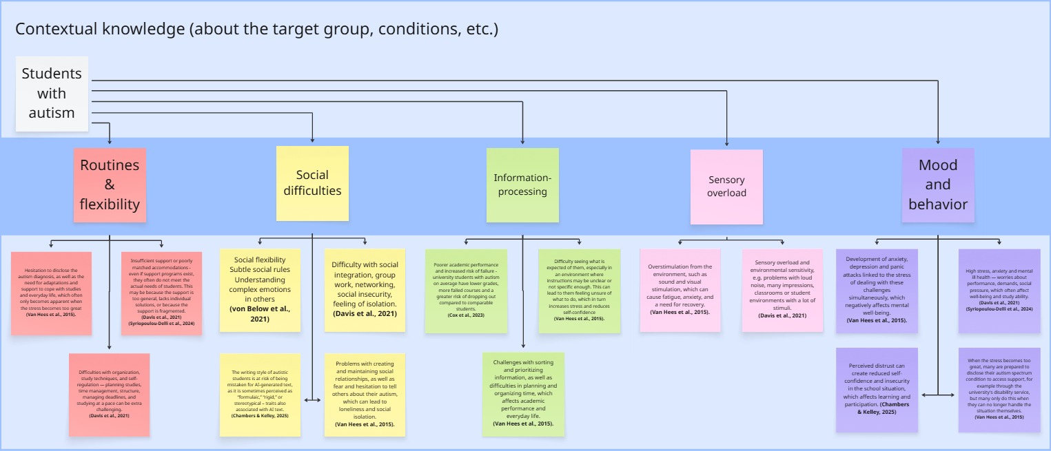
University studies demand a high level of self-management: planning, prioritization, navigating multiple systems, and handling uncertainty.
Through research and course material, we identified that students with autism often face:
- Challenges with planning and executive function
- Increased cognitive load from fragmented systems
- Stress caused by unclear expectations and shifting deadlines.
These challenges can become barriers to education, not because of ability, but because systems aren’t designed with these users in mind.
Ethical ideation pivot - a critical decision
Early in ideation, we explored a writing-support tool based on an emerging issue. Autistic students are more frequently flaggedby AI-detection systems because their writing can appear more monotone or structured.
Our first instinct was to help students adapt their writing style. We quickly realized this was ethically problematic. Itwould place responsibility on the student rather than on a flawed system.
Designing a fair AI-detection system would be the ethical solution, but beyond the scope of the course.
Instead, we reframed toward a problem we could address responsibly. Planning support, a well-documented barrier for autistic students in higher education. This decision ensured that:
- We didn’t “fix the user,”
- The solution respected identity and autonomy
- The design remained realistic and impactful.
Target users
Primary: Higher-education students with autism (mild diagnosis or similar needs).
Secondary (design-for-all): students who benefit from structure, clarity, and reduced cognitive load, including users with:
- Visual impairments
- Cognitive accessibility needs
- Motor or alternative input needs (keyboard-only, joystick, assistive devices).
UX Goals
We translated the problem into clear UX goals:
- Reduce cognitive load through structure and prioritization
- Increase predictability to lower anxiety
- Reduce stress by clarifying time, progress, and expectations
- Support autonomy (assist, don’t automate)
- Ensure accessibility across vision, cognition, and interaction
These goals guided every design decision.
Creating design principles
Based on literature on universal design, accessibility, and design-for-all, we defined project-specific guidelines that functioned as design rules throughout the process.
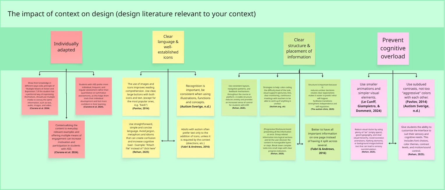
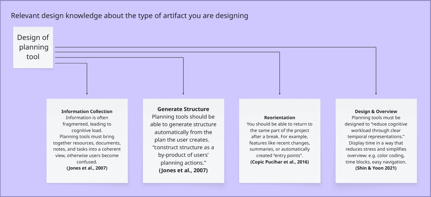
1. Consistent structure and navigation
Why: Predictability reduces anxiety and cognitive effort.
Impact: Repeated layouts, stable navigation, and familiar patterns across views.
2. Calm, low-stimulation visual design
Why: Overstimulation increases cognitive fatigue, especially for users with sensory sensitivity.
Impact: Minimal UI, controlled color palette, limited motion, generous whitespace.
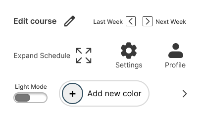
3. Icons + text, never icons alone
Why: Icons can be ambiguous; pairing them with text improves clarity and accessibility.
Impact: Reduced interpretation effort and increased learnability.
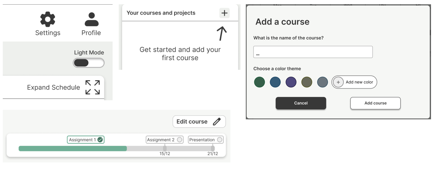
4. Information prioritization & progressive disclosure
Why: Too much information at once increases cognitiveload.
Impact: Overview first, details on demand.
5. Clear feedback and error prevention
Why: Confirmations reduce stress and prevent accidental actions.
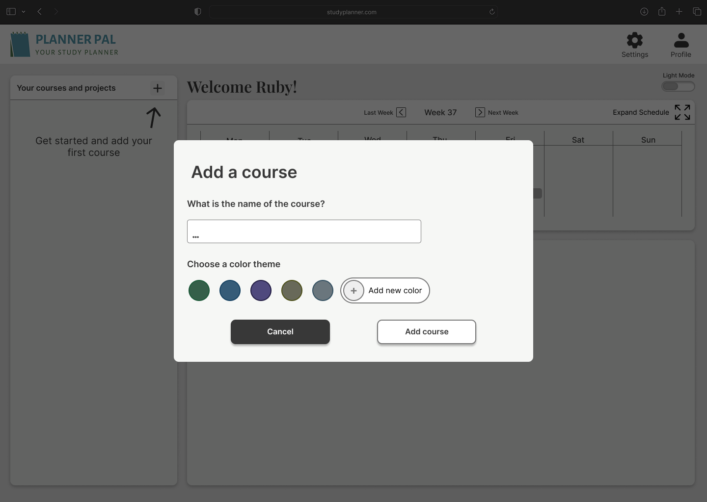
Impact: Explicit confirmation dialogs and system feedback.

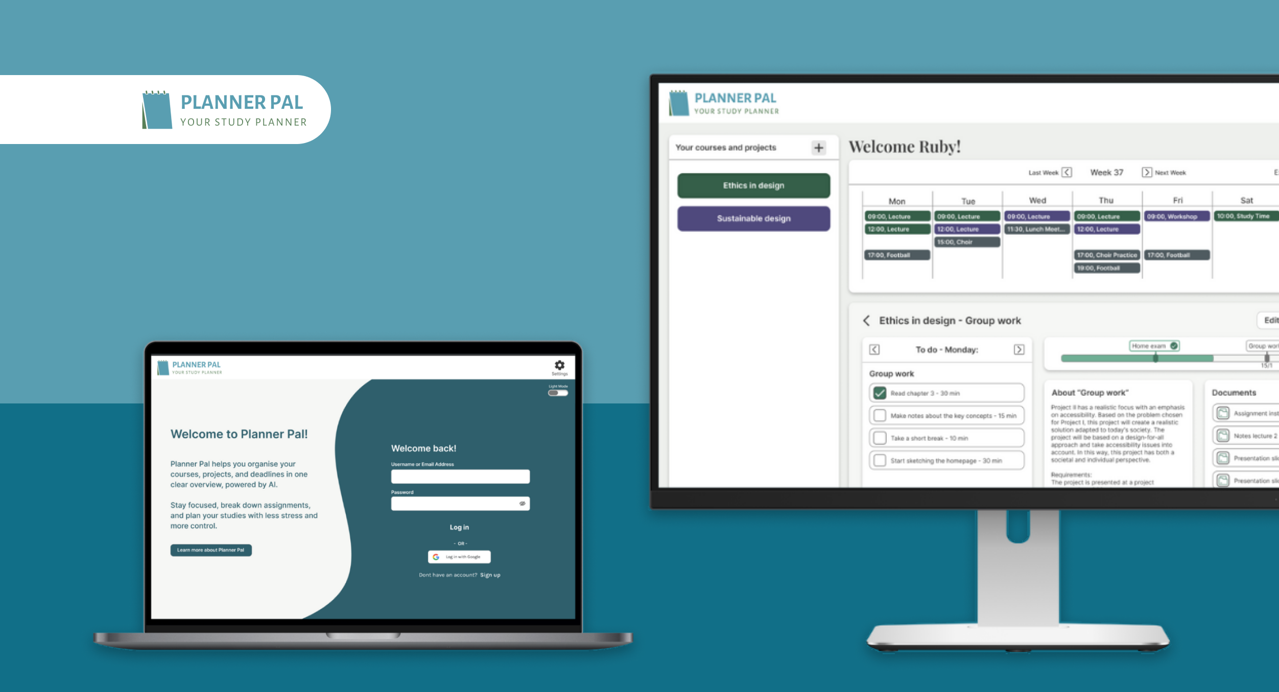
The solution – Planner Pal
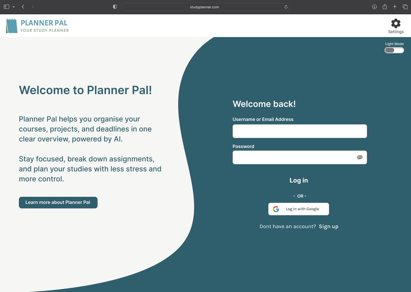
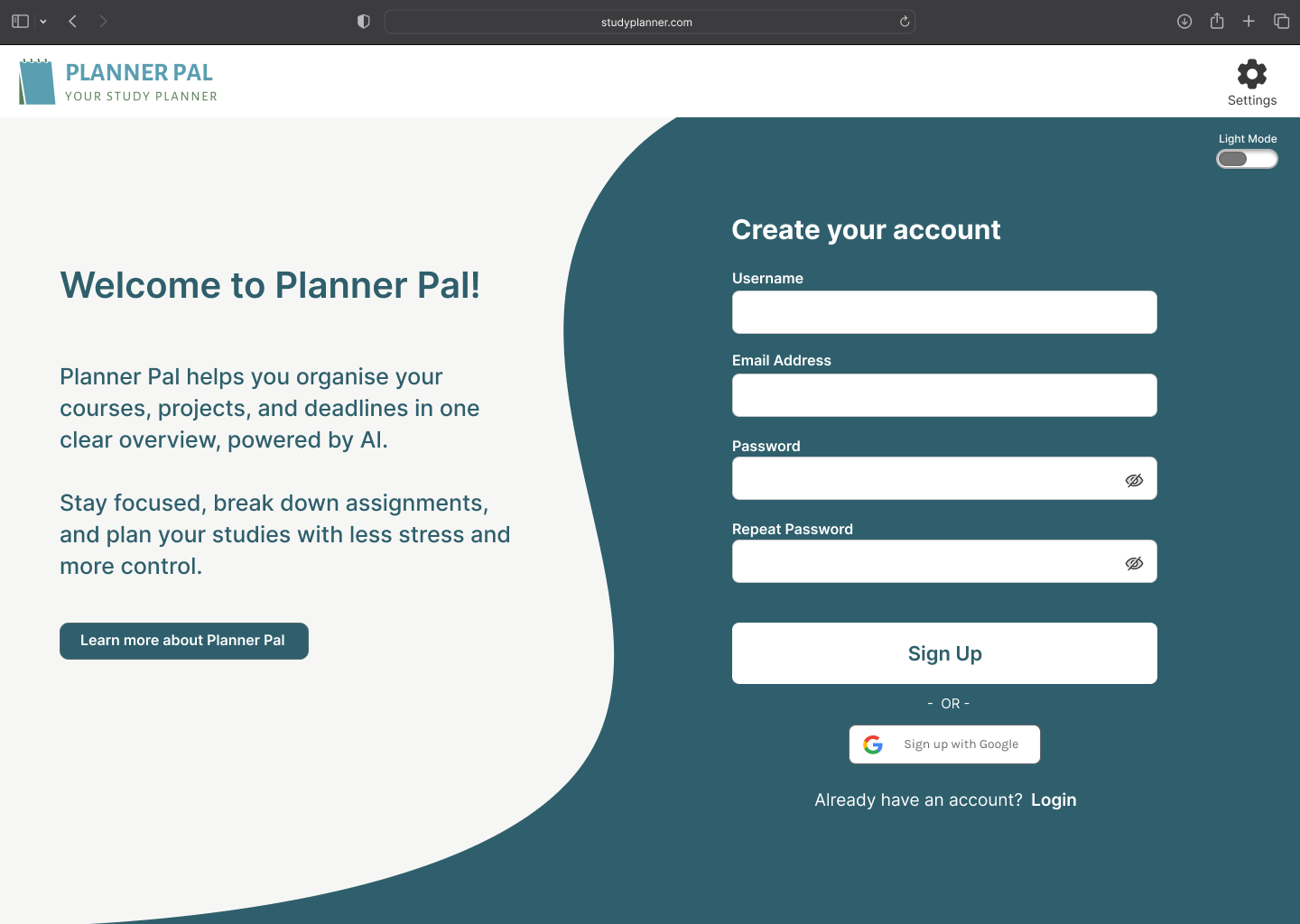
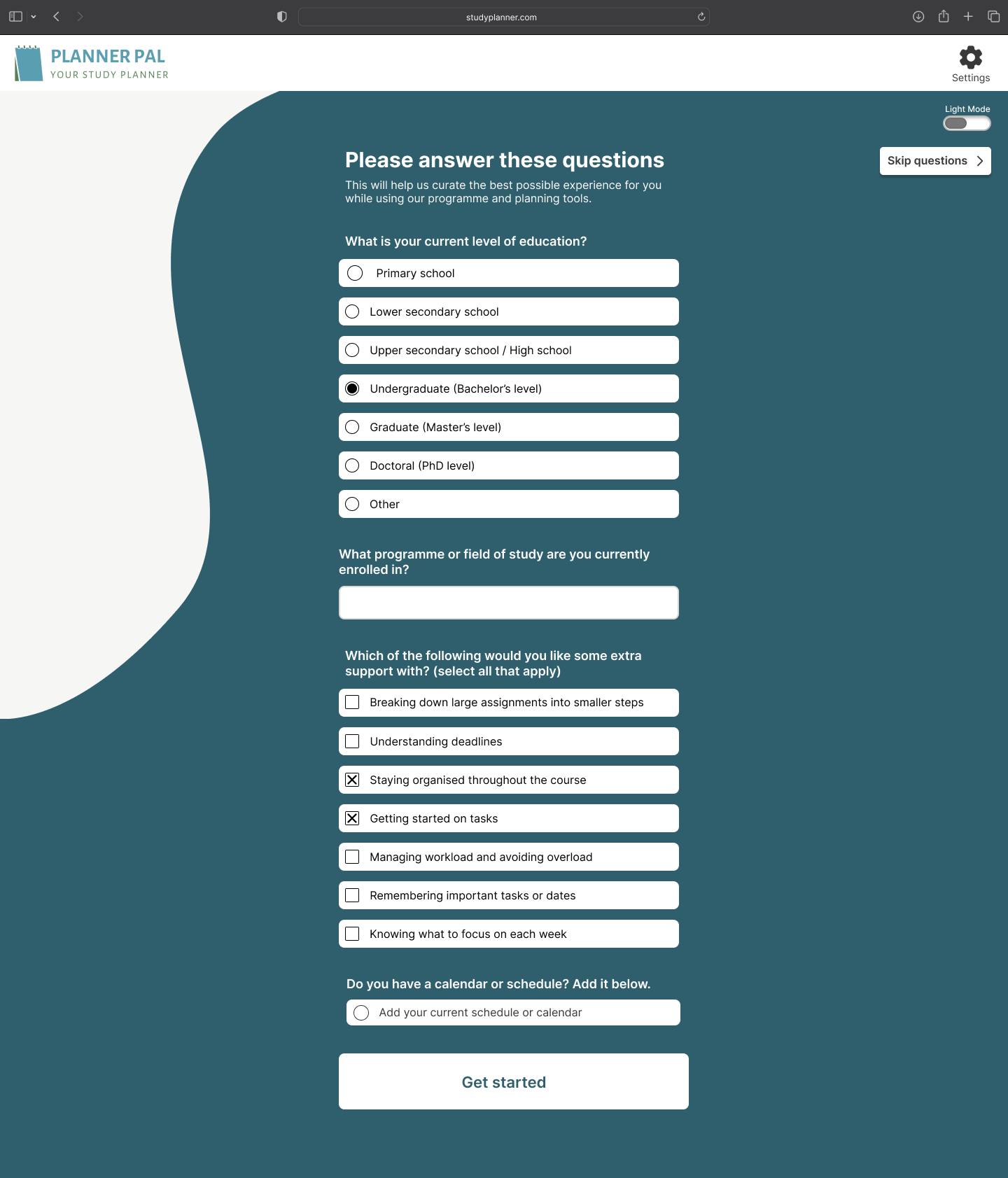
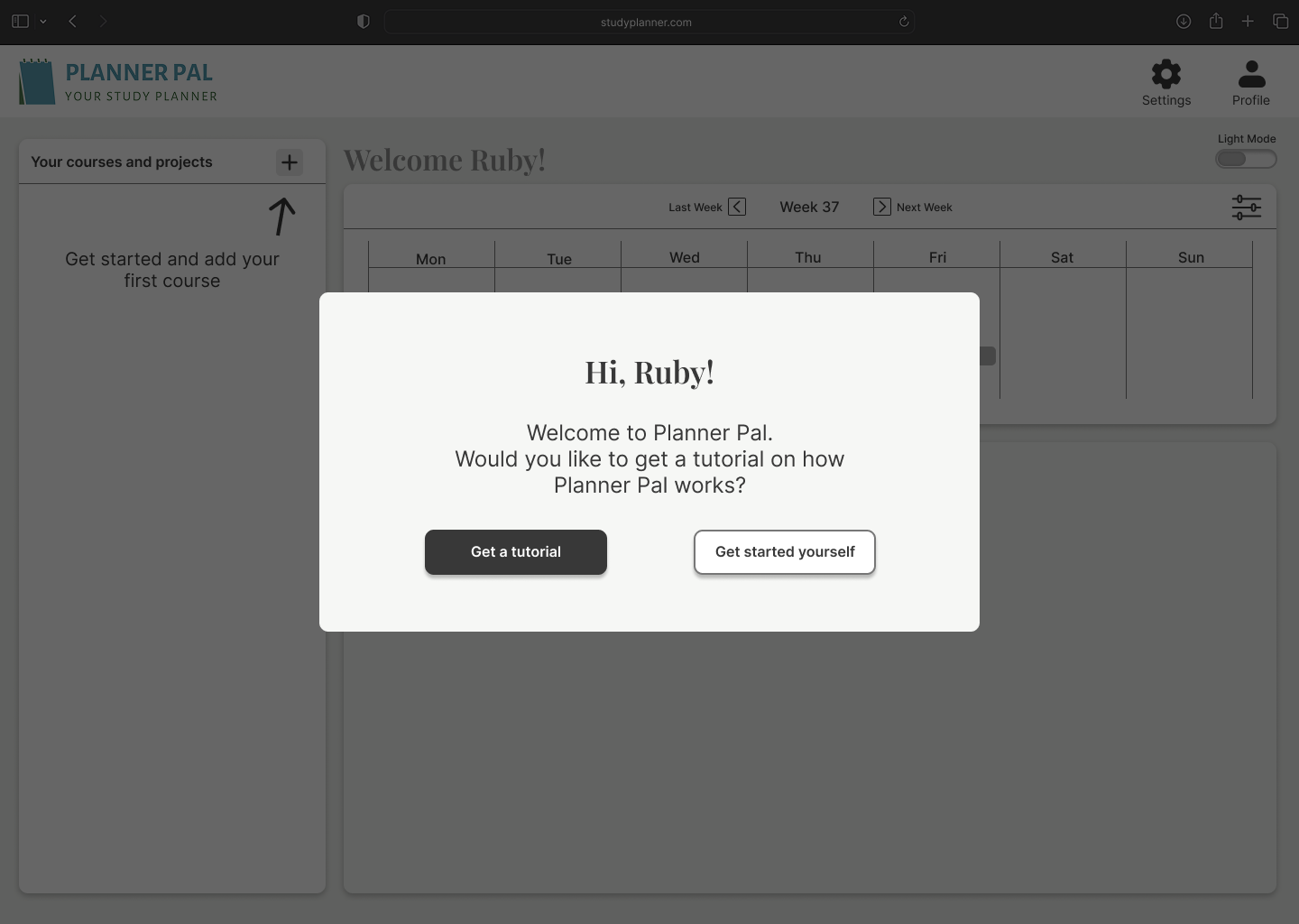
Entry & onboarding
We designed a clear entry flow and optional onboarding questions to understand user needs without locking them into a fixed profile.
Core flow
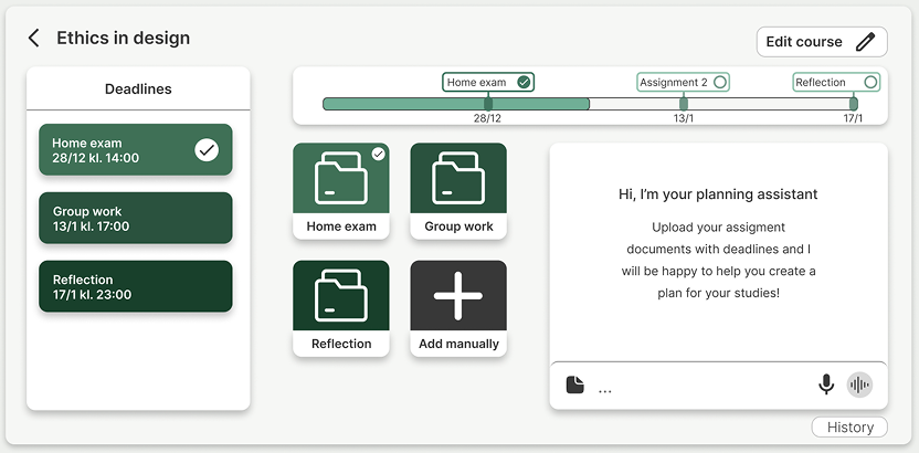
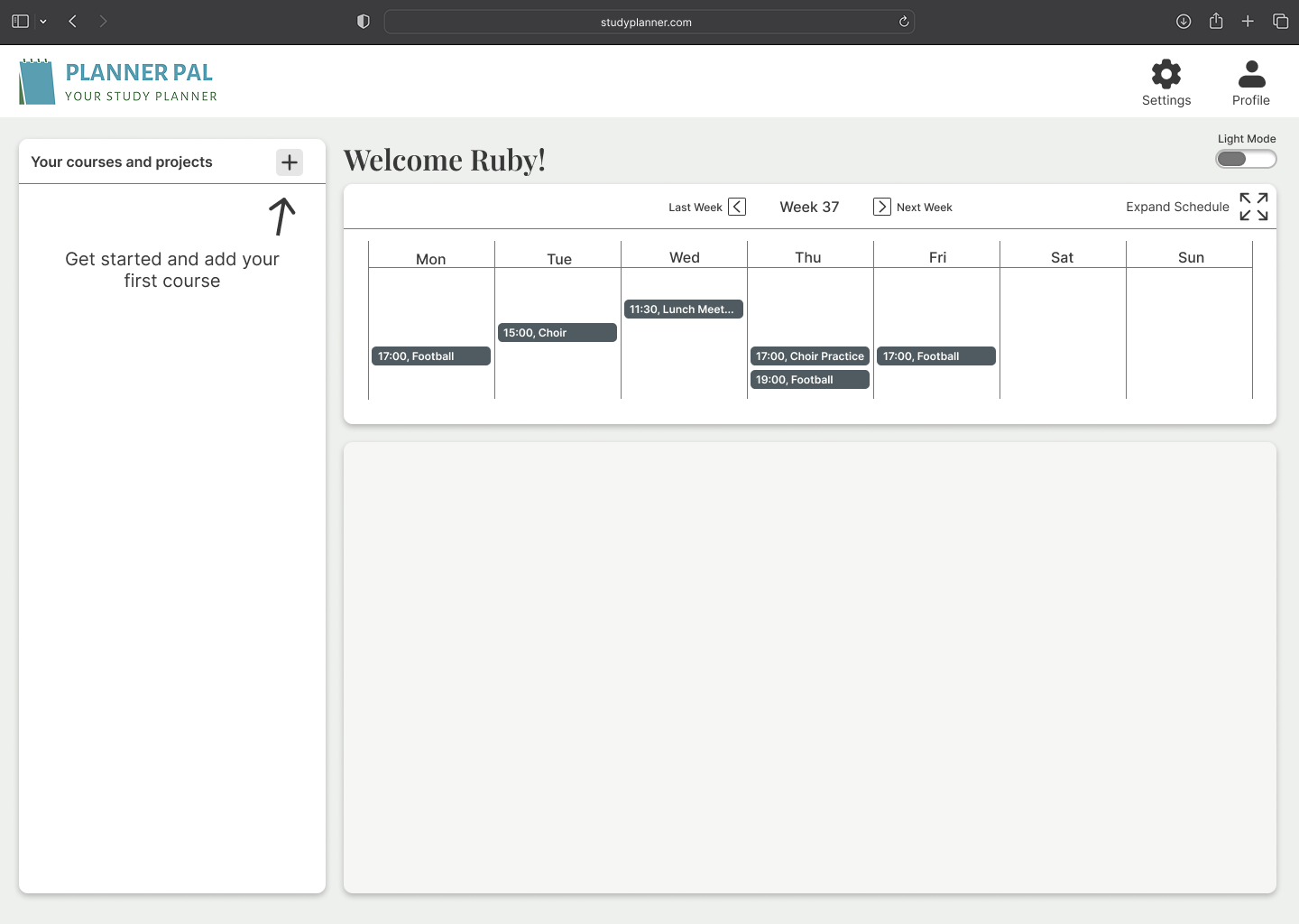
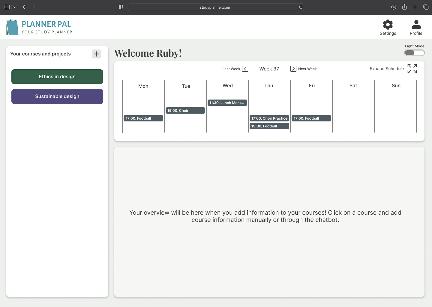
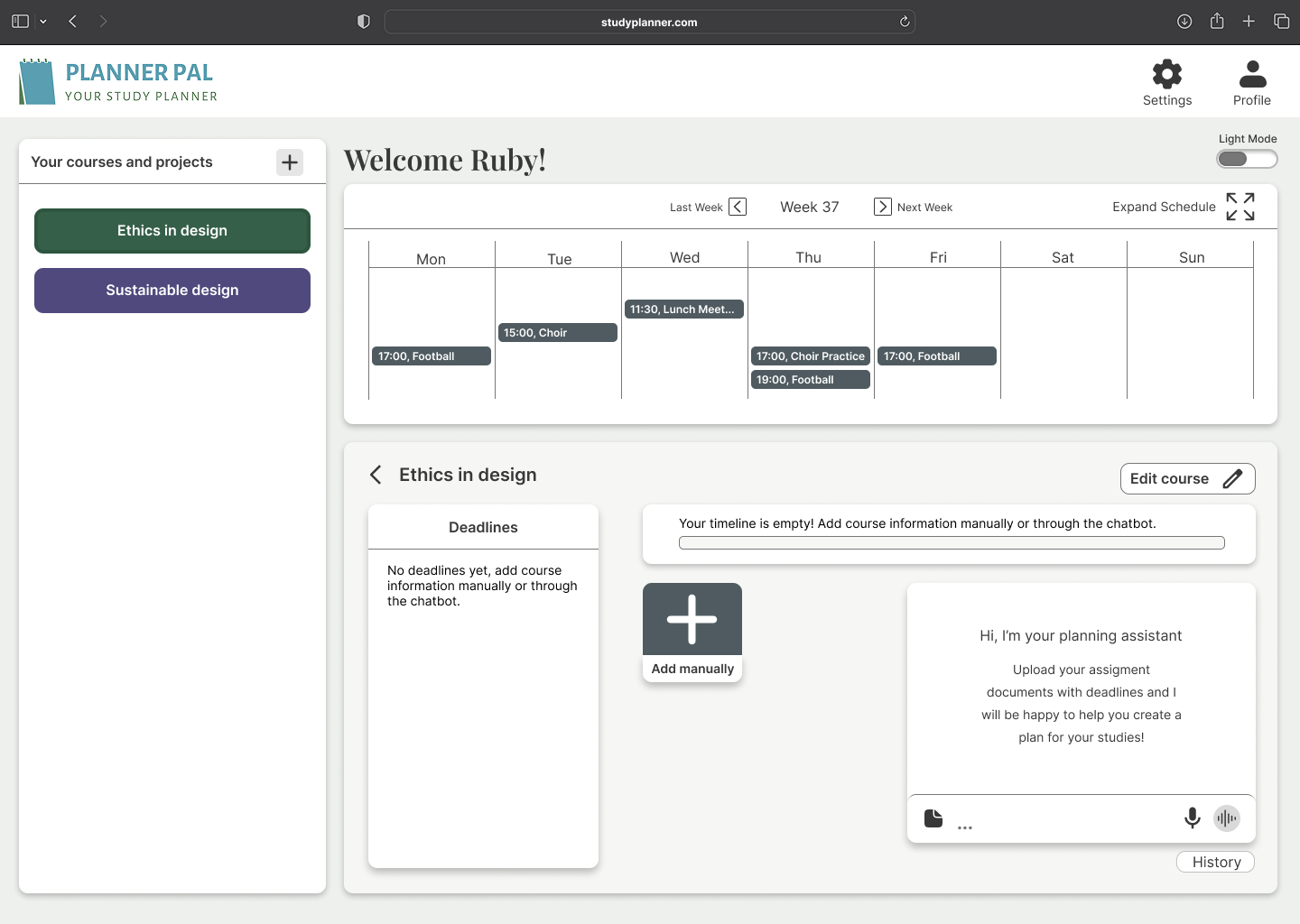
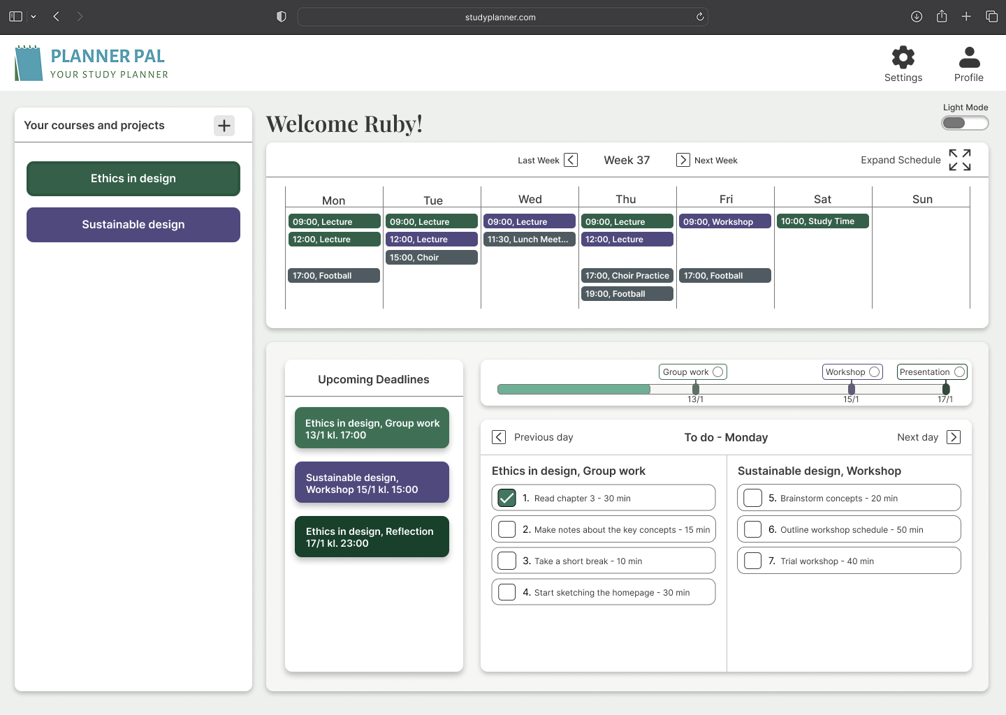
The structure mirrors how students think about their studies.
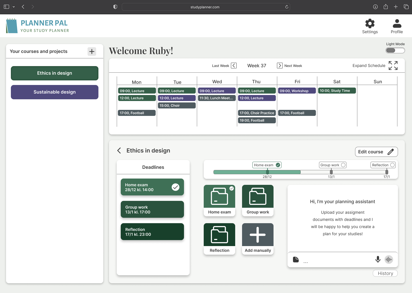
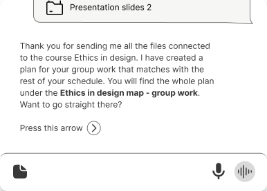
AI assupport, not authority
AI functionality is positioned as optional guidance, not decision-making, but to preserve autonomy and avoid over-dependence.
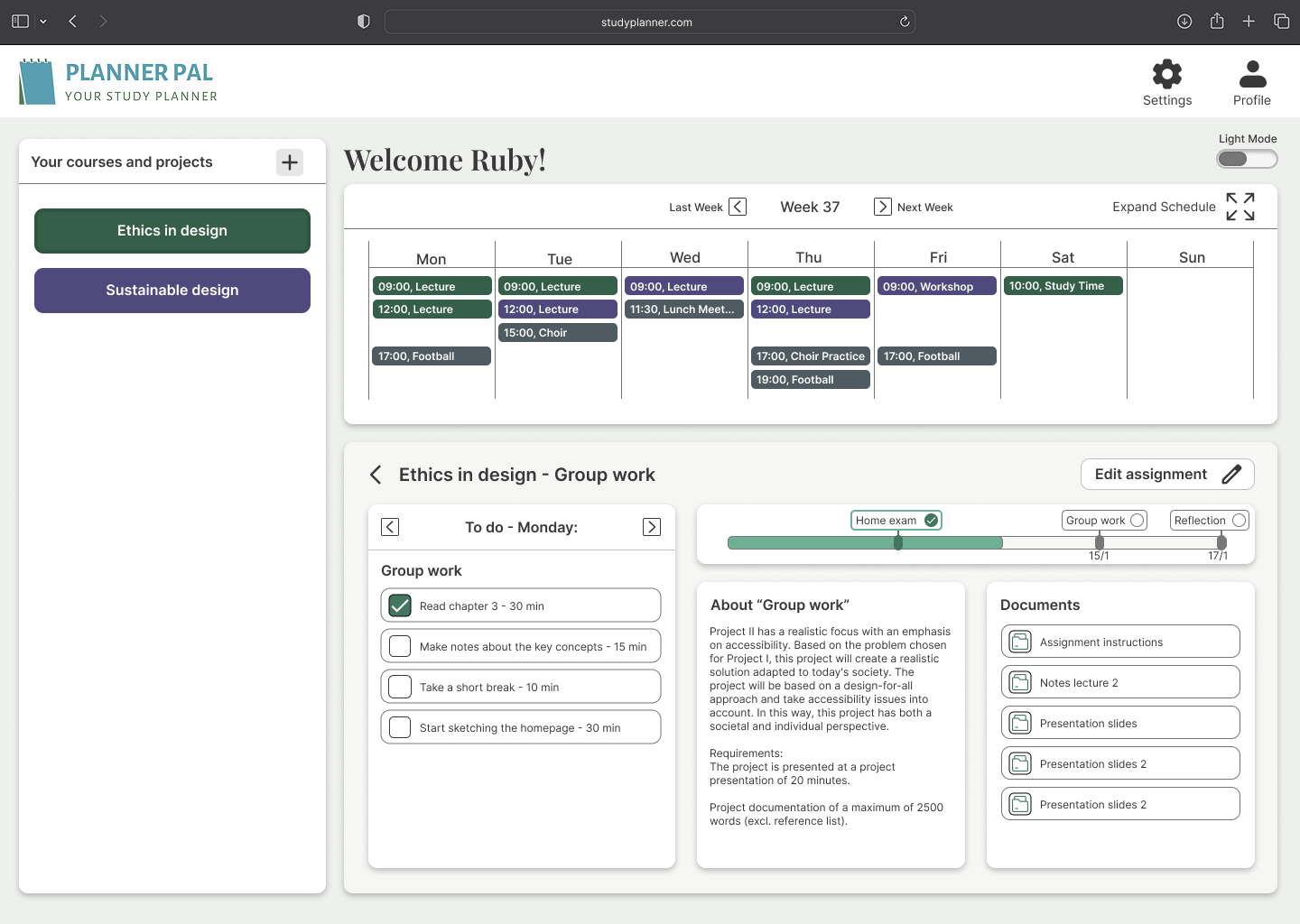
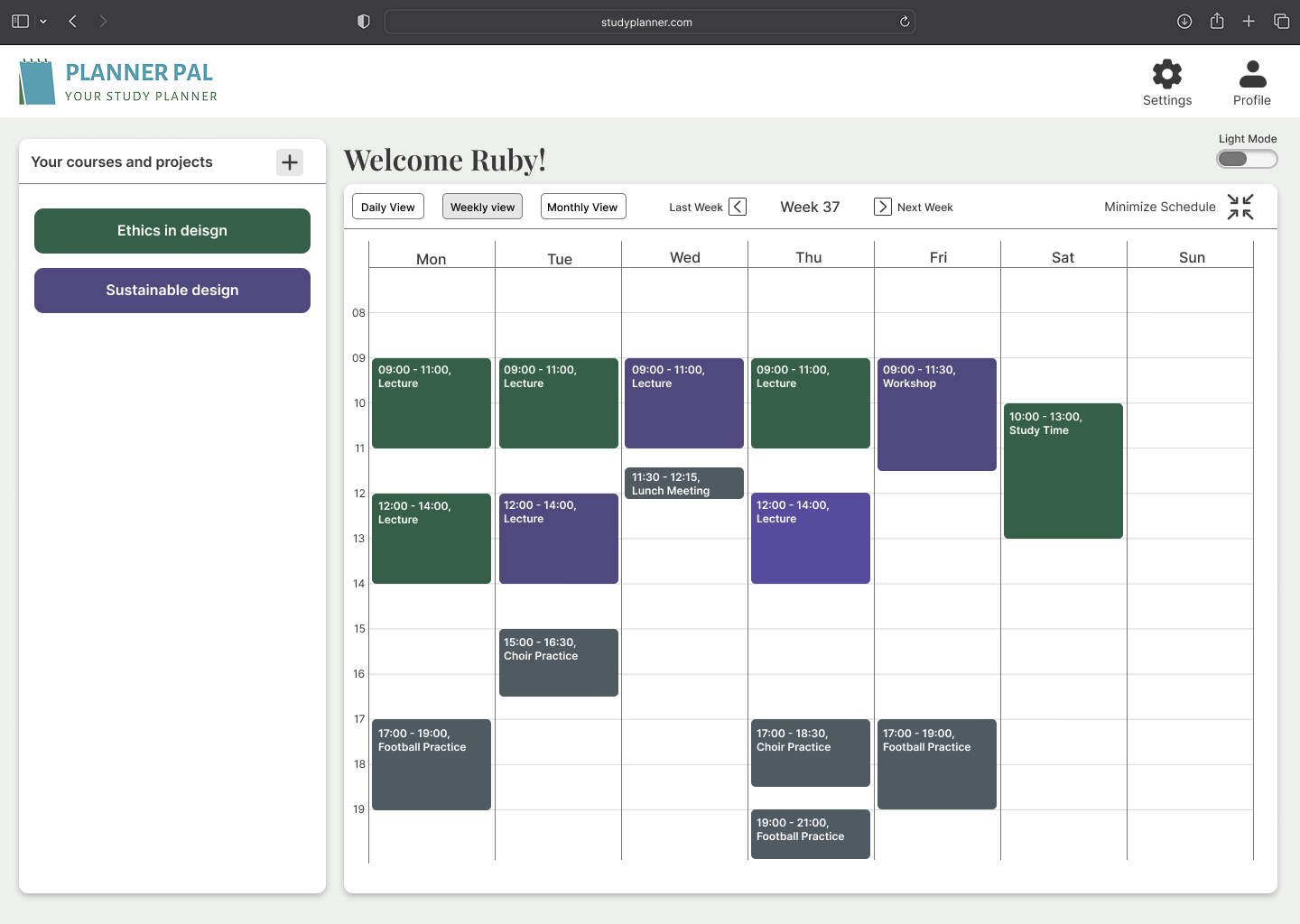
Planning, time clarity & overview
Clear timelines and expandable schedules reduce uncertainty and support flexible use.
Reducing fragmentation
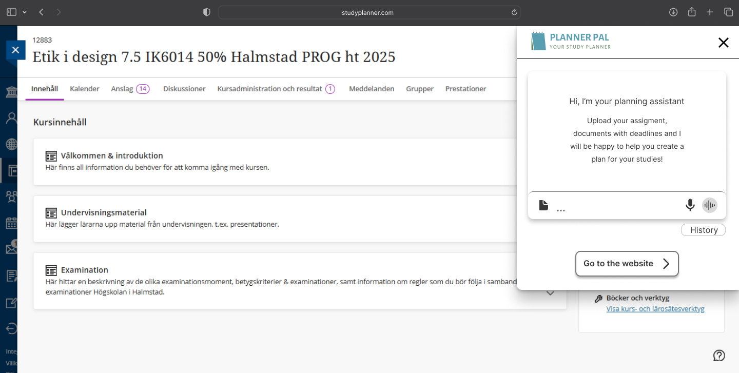
We designed an overview mode and browser extension to reduce system switching
Accessibility& universal design
Visualaccessibility:
- WCAG-compliant contrast
- No reliance on color alone
- Clear hierarchy and readable typography
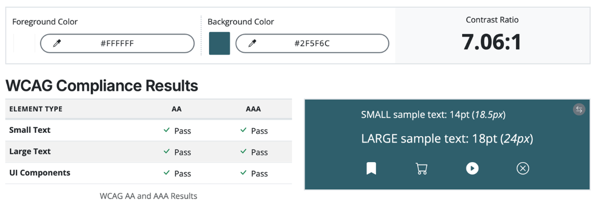
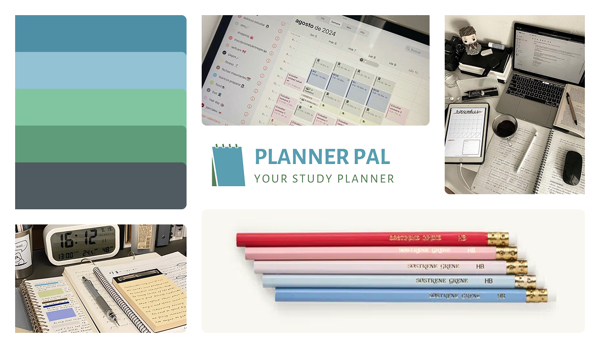
While calm, low-intensity colors are often recommended for users with sensory sensitivity, we identified a clear trade-off between creating a visually calm interface and meeting WCAG AAA contrast requirements. This required careful balancing to ensure both accessibility compliance and a low-stimulation visual experience.
Cognitive accessibility
- Reduced visual noise
- Clear hierarchy and grouping
- Predictable interaction patterns

In addition to visual considerations, the interface structure was designed to work with operating system–level accessibility features such as screen readers and keyboard navigation. Clear hierarchy and logical grouping support assistive technologies and improve navigation forusers who rely on built-in accessibility tools.
Flexible ways to interact
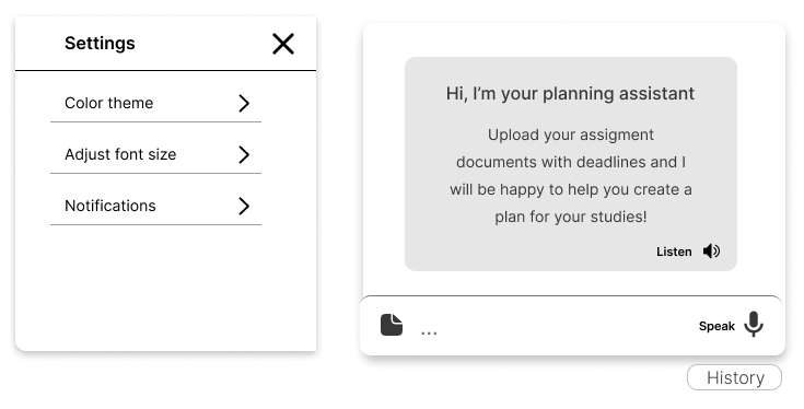
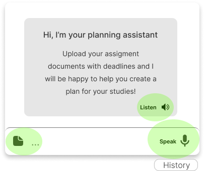
Planner Pal also supports multiple ways of interacting with and providing information. Users can work with planning through text and speech, and planning content can be built from different input formats. This reduces reliance on a single mode of interaction and supports users with different cognitive preferences and abilities.
Motor & alternative interaction
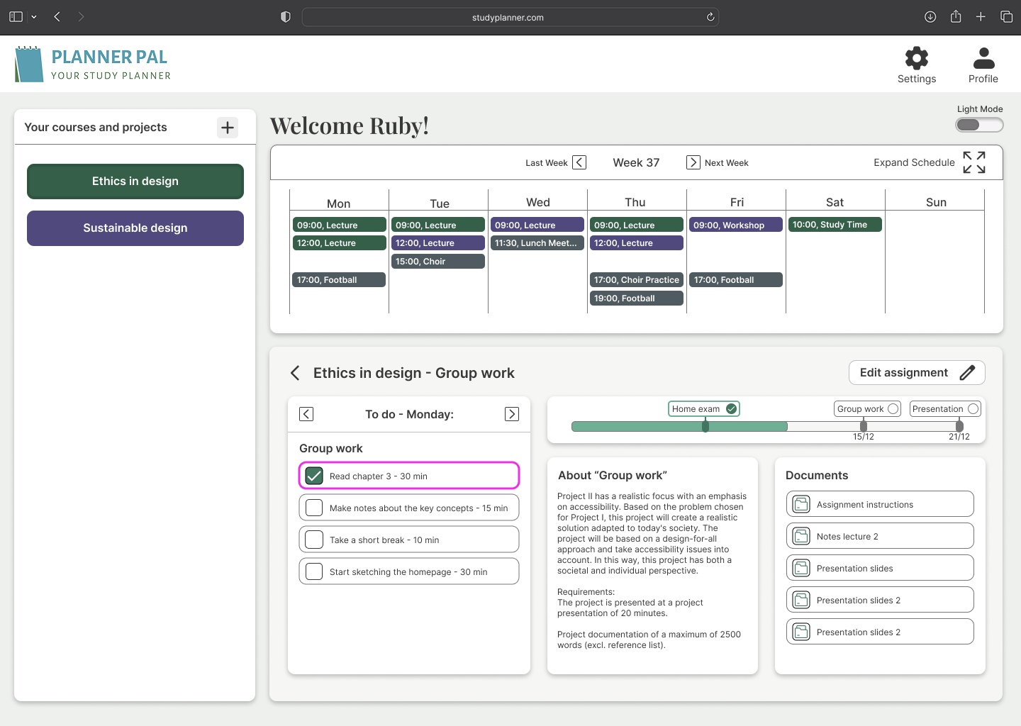
We considered users who don’t rely on mouse/touch. Predictable layouts and spacing support keyboard navigation and assistive input devices. Here is an example of how planner pal highlights elements with a pink outline while using a joystick.
Browser extension as an alternative interface
We also explored how Planner Pal could exist as a browser extension, providing a more compact and immediately accessible version of the tool. This allows students to check deadlines, tasks, and key planning information without leaving their current study context, and reduces the need to navigate a full interface when that creates unnecessary friction.

Why this project matters
This project shows how ethical thinking, accessibility, and UX decision-making are deeply connected.
By refusing to “fix the user,” and instead designing systems that adapt to human diversity, we created a solution that:
- Supports autonomy
- Reduces stress
- Promotes inclusion in higher education.
Reflection & next steps
Designing for autism sharpened my ability to designfr everyone. Accessibility isn’t a constraint, it’s a design accelerator. Ifwe were to keep working on this project the next steps would have been:
- Usability testing with target users
- Iteration on customization depth
- End-to-end testing with assistive input methods

