Infotainment system
Designing a safe Persona-Based Infotainment System
Project type: UX/UI & Interaction Design
Project year: 2023
Project role: No defined role
Client: School project
Note: The infotainment system isbuilt in Swedish. All descriptions, explanations, and case study content beloware provided in English.

O read the case study down below
Methods
- Goal-Directed Design
- Personas and Scenarios
- Sketching and wireframing
- Prototyping
- Heuristic Evaluation
Tools
- Figma
- Miro
Background
This project started with a challenge: How can we design an infotainment system that supports vastly different drivers, without overwhelming or distracting them?
As a part of a university course in interaction design, our team explored how in-carsystems can go beyond traditional dashboards and become true extensions of user´sneeds. With a focus on goal-directed design, we created two distinct user journeys based on deeply researched personas.
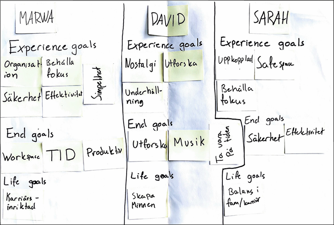
Understanding the users
We were assigned three personas, each with unique needs:
- Marwa, a busy professional who wants focus and efficiency.
- David, a curious explorer seeking music, memories, and spontaneous adventures.
- Sarah, who values her car as a personal space of comfort.
Through these personas, we defined experience goals, end goals, and life goals that guided every design decision we made.
Persona Goals
Process & Methods
We followed a structured but also flexibel process to turn user goals into a safe, intuitive interface grounded in interaction design principles:

Designing the Experience
As the assignment required us to focus on two out of three personas, we chose Marwa and David, the most contrasting in goals and behavior. We were also tasked with creating key path scenarios for both, grounded in their individualtasks and goals. This allowed us to design two distinct system concepts with different priorities, while applying shared principles of safety and usability.
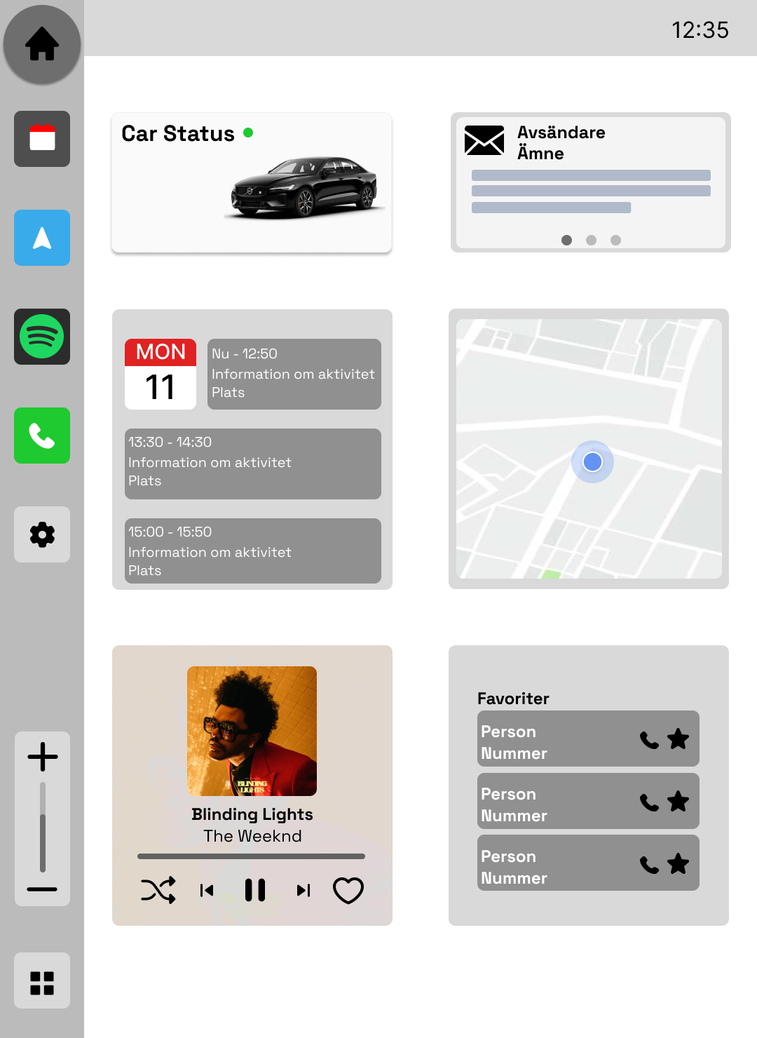
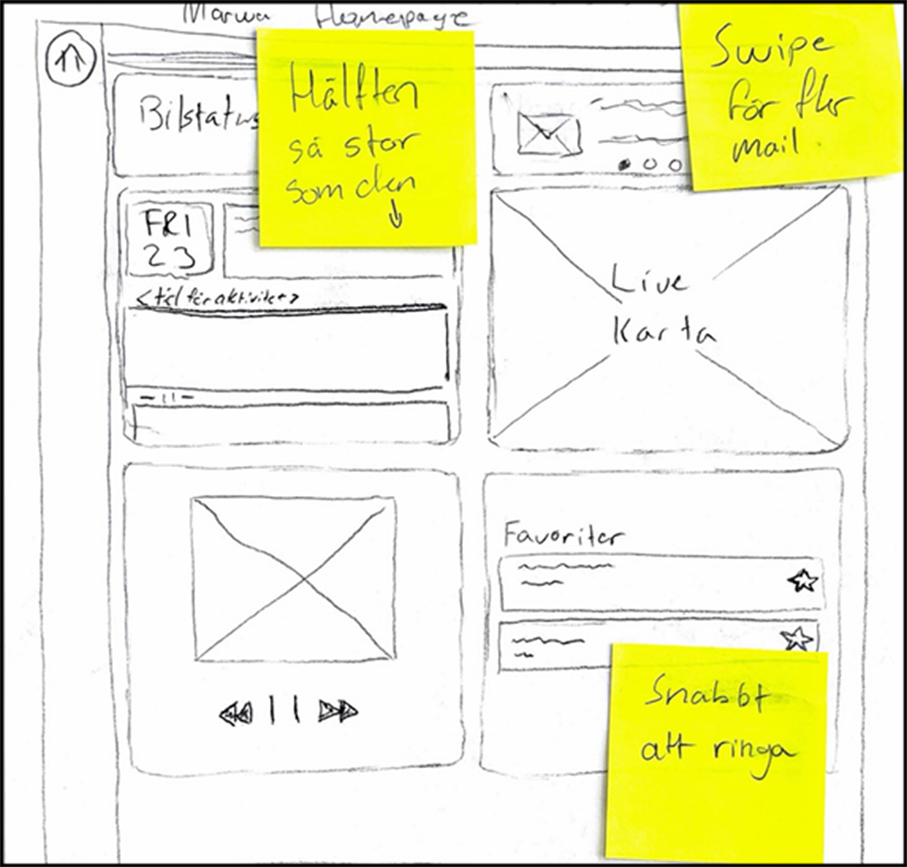
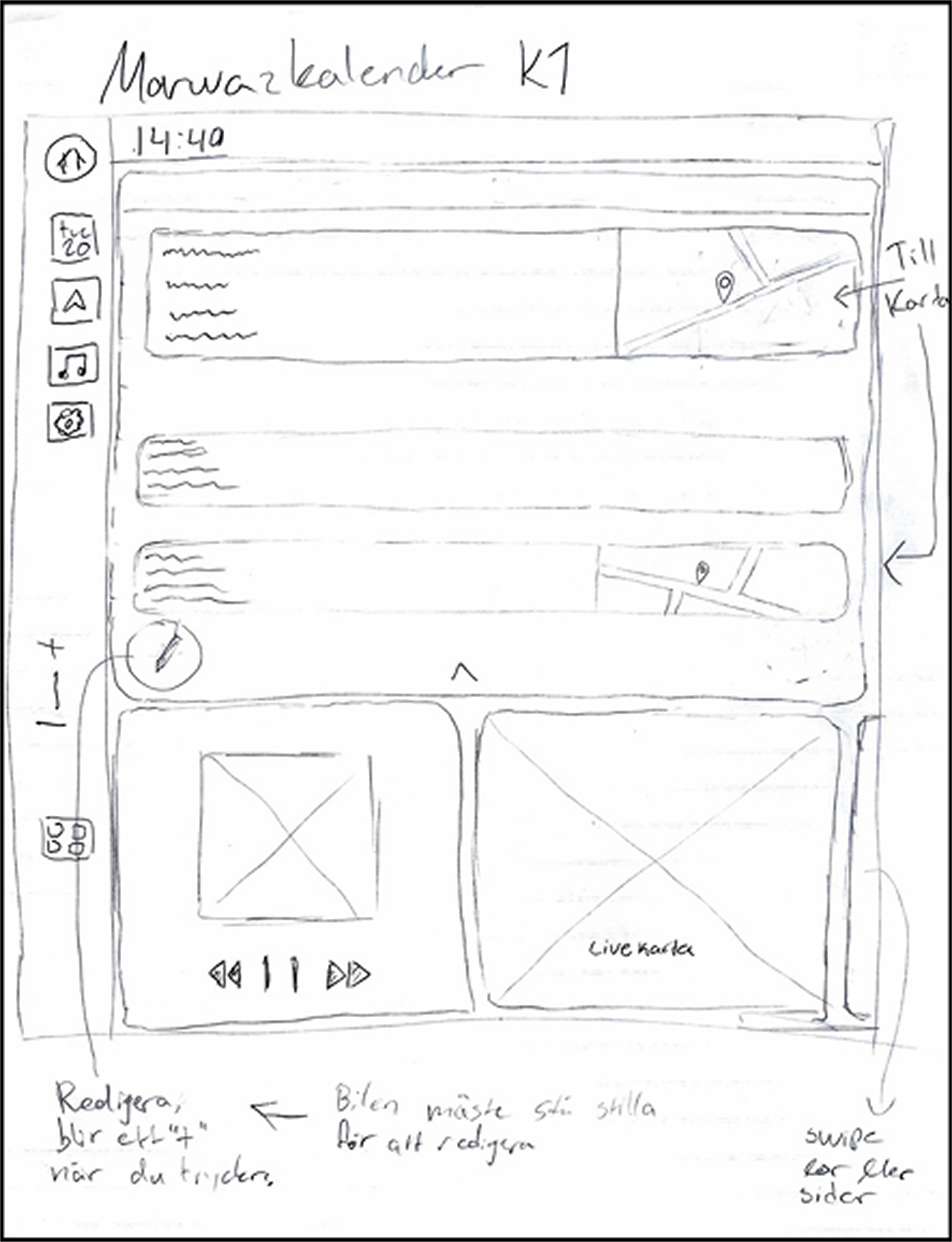
The first sketch on Marwa´s homescreen
Marwa´s System – Productivity on the go
Marwa has a busy work schedule. She wants to stay productive and make the most of her time. That’s why she takes the opportunity to check her emails while in the car. She can see which emails have arrived, including the subject and sender. On her way to the next meeting, she needs to reschedule an upcoming appointment because a colleague has run into car trouble. Using the infotainment system, Marwa opens her calendar and quickly reschedules the meeting with just a few taps. While viewing her schedule, she gets an overview of her day and taps the next meeting to activate navigation to that destination.
For this, we needed to:
- Prioritizes calendar, mail, and favored contacts
- Information hierarchy designed for quick scanning
- Touchscreen and physical climate controls to minimize distraction
- Seamless transitions between tasks and navigation

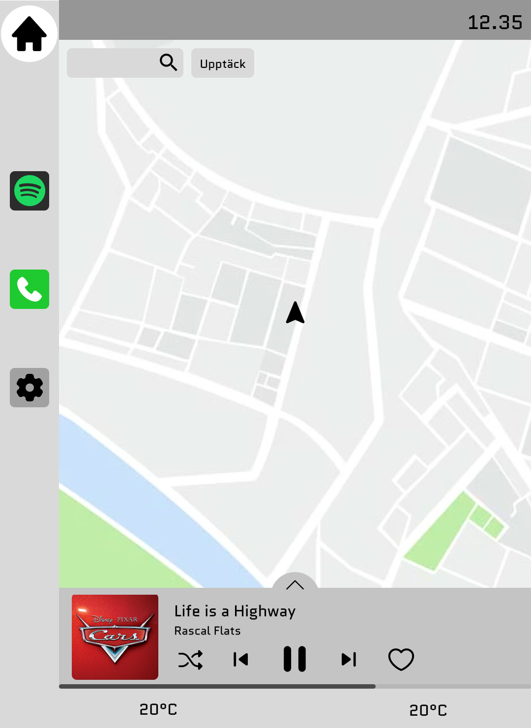
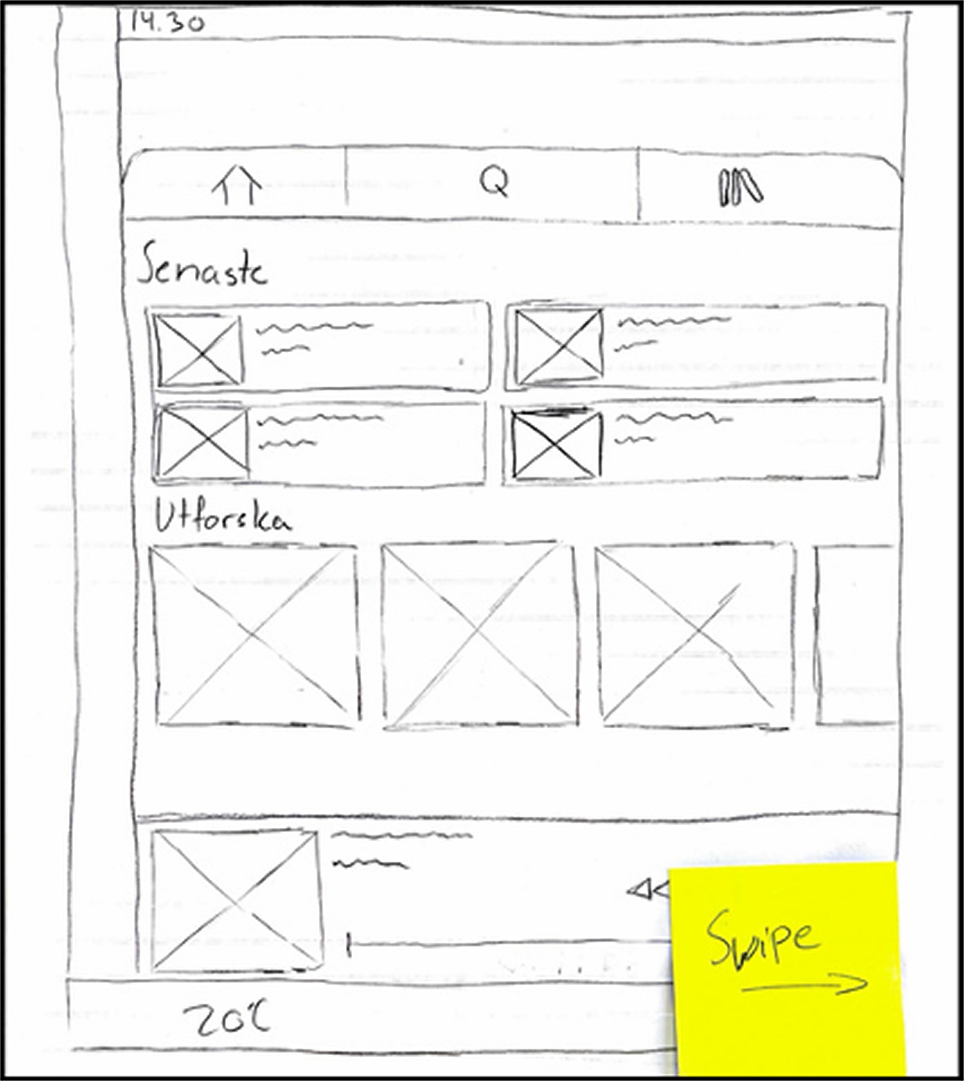
The first sketch on David´s homescreen
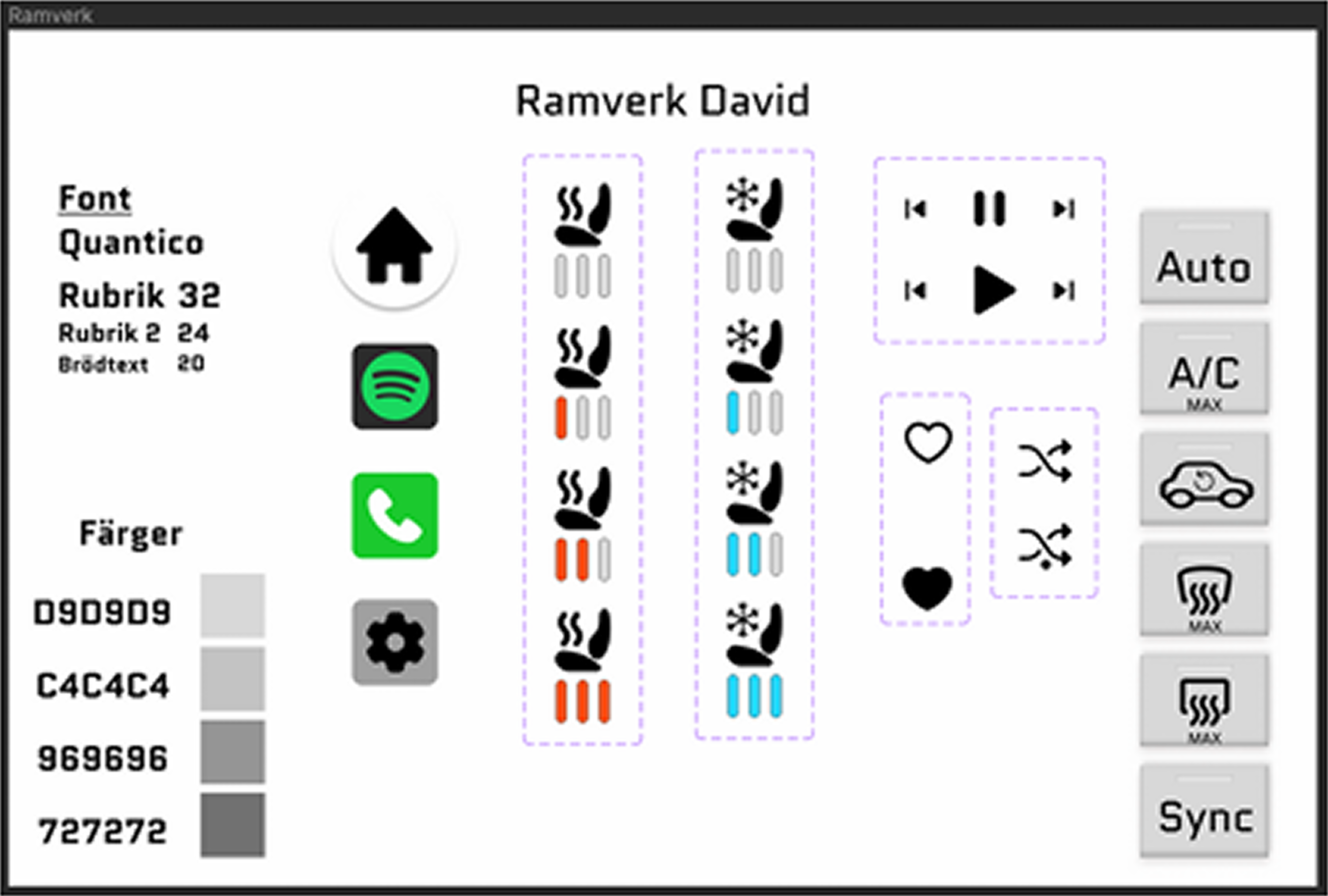
David’s System – Smooth exploration experience
David is feeling bored and wants to get out of the house. He decides to go on an adventure in the car. Once seated, he selects the “points of interest” featureand sees suggestions for local attractions, but decides to zoom out on the map to find something new. Through posts from other users, he gets inspired and cann view descriptions and photos of places others have visited. David picks a new destination, and the map zooms in. Then he taps one of three playlists tailored to him, and the music starts playing.
For this, we needed to:
- Map-centric home screen for spontaneous discovery
- Built-in music player with nostalgic emphasis
- “Discover” feature showing nearby attractions
- Physical buttons for climate and consistent gesture interactions

To keep the driving users focused, we placed climatecontrols on a dedicated panel below the main interface using physical buttons. It’s always there, familiar, tactile, and easy to locate without looking. In that way, users can stay in their flow, whether they’re reading an email or planninga route, and still adjust the temperature without skipping a beat.
Climate Control Sketch

Wireframes and Visual Flow
Our design balanced functionality with safety. Both concepts used a 1080x1480px vertical layout with persistent music and navigation access, allowing the user to stay oriented while interacting.
Marwa Sketches

Calender
Phone
David Sketches

Music
Search
Discover
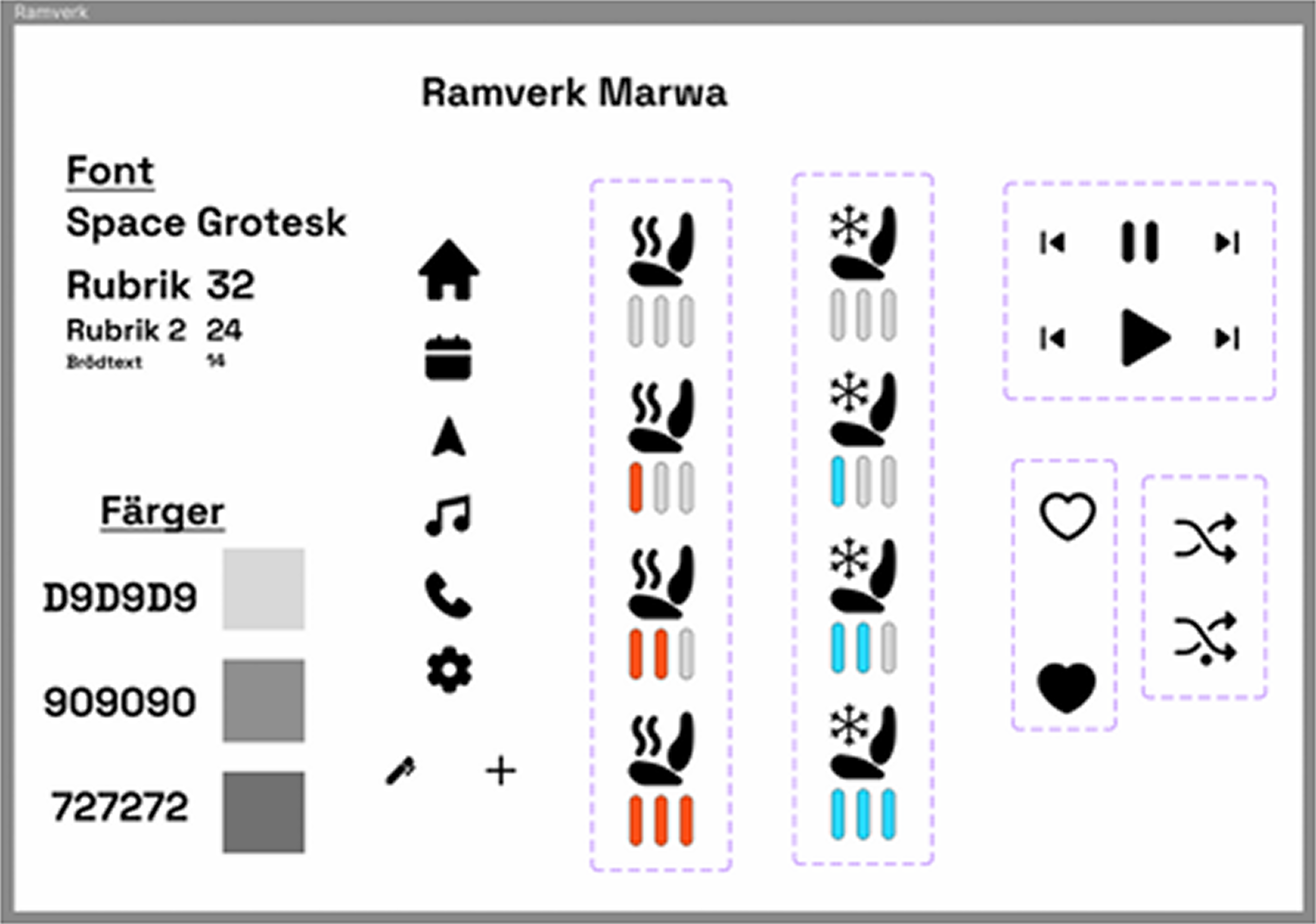
Before moving into detailed wireframes, we created a design framework to guide structure, layout, and functionality. Based on Cooper’s method, this helped us define the system’s posture, input methods, and content hierarchy, ensuring our digital prototypes stayed aligned with bothuser goals and interaction principles.
Marwa
David
Expert evaluation & Iteration
To ensure our design worked as intended, we evaluated it once it reached a sufficiently detailed stage. Using a structured framework, we identified usability issues, created a to-do list, and iterated to refine both the interaction flow and interface clarity.
Our refinements:
Marwa
- Added back buttons to deeper navigation levels
- Enabled undo tap action on the calendar map view
- Included feedback for failed search results (e.g., no destinations found)
- Planned visibility of ongoing phone calls when switching screens (not yet implemented)
David
- Introduced progress bars where relevant
- Reviewedand applied color to reinforce functional areas
- Planned a phone call overlay showing call status and caller identity (not yet implemented)
- Evaluated the need for more confirmation dialogues
- Discussed a potential customization feature for personal user preferences
- Removed the redundant menu button from the side menu
- Ensured “no results found” messages were included on searchable pages
Most items from the to-do list were implemented, while we also continued refining parts of the system that were still under development. Like in Marwa’s case, we didn’t manage to implement the phone call visibility, which is why that issue remained in the second round of expert testing.
Feedback
After completing our own expert evaluation based on heuristic principles, we also received external feedback from peer groups working on similar projects. Their insights helped us view the design from a fresh perspectives. They identified usability gaps and clarified parts of the interface that felt unclear or inconsistent.
Key feedback on Marwa’s system included:
- The navigation search was unclear or missing
- Phonecalls required multiple taps to initiate
- Music functionality felt limited (no playlist or song selection)
- Adding activities involved too many steps and lacked a field for notes or dates
- Pages like the calendar lacked clear titles, making navigation harder
- The purpose of some UI elements (e.g., top boxes, menu button, settings) was unclear
Key feedbackon David’s system included:
- No visible call overlay when switching pages during a phone call
- Missing or unclear settings page
- Confusion about having navigation on both the home screen and the menu
- Unclear purpose of four menu icons
- Lack of numeric input in the phone app
Most items from the to-do list were implemented, while we also continued refining parts of the system that were still under development. Like in Marwa’s case, we didn’t manage to implement the phone call visibility, which is why that issue remained in the second round of expert testing.
Iterations based on the Feedback:
We used the feedback to guide a new round of design updates and refinements. Several elements were adjusted to improve clarity, reduce cognitive load, and streamline user flows:
Our refinements:
- Improved the calendar interaction for Marwa by simplifying the "+" button functionality and adding scroll to view dates
- Added a search function to the navigation screen
- Introduced swipe actions in the mail interface
- Built out a dedicated settings frame for both personas
- Enabled scrolling in Marwa’s contacts list
- Designed a music home screen with playlist selection
- Applied color accents to indicate where in the system the user is·
- Revisited the number and placement of app icons to explore if three or four icons worked best
- Removed redundant menu buttons from both systems
- Added a downward arrow for returning to home
- Finalized David’s phone screens and clarified how phone activity appears during multi tasking
These updates improved usability by clarifying navigation, reducing friction, and aligning the interface more closely with user expectations. In a driving context, small adjustments like these can make a big difference in safety and cognitive load
Inclusive design exploration
As a part ofthe project, we were tasked with exploring inclusive design solutions. We asked ourselves the question:
“What happens when the driver can’t use touch?”
This was tested through a scenario:
Social context: The whole family in the car with two screaming children
Limitation: Unable to use touch controls
We then adapted the system to work with:
- Voice commands
- Eye tracking
- Gesture recognition
Where elements highlights as the user’s gaze or finger hovers.
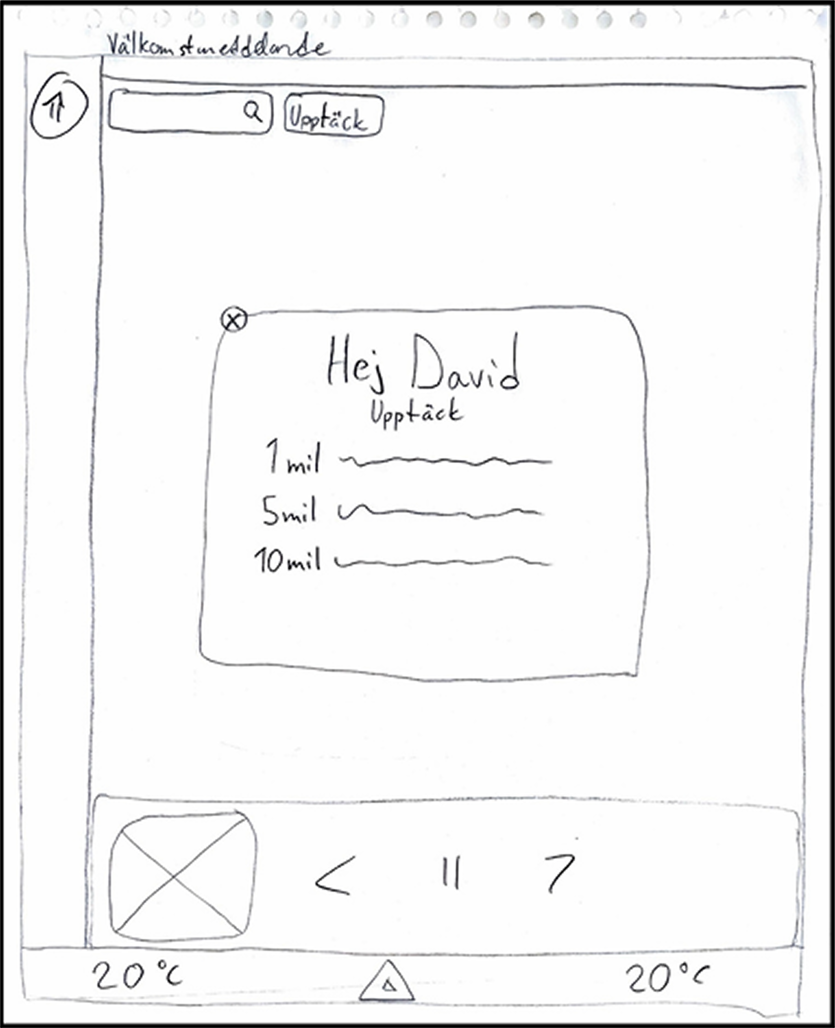
Inspired by Apple Vision Pro, we proposed a gaze plus pinch interaction model as an alternative to touch-based commands. Where the elements highlights as theuser’s gaze or finger hovers.
In Marwa’s scenario,she could simply glance at her calendar and pinch her fingers to view the day’s activities without saying a word.
In the picture on Marwas homepage you can see how the calendar element is highlighted with a bright border around it.
Final result and key outcomes
The project resulted in two modular infotainment system concepts, tailored to contrasting user needs but built on shared principles of clarity, safety, and adaptability. Expert testing helped refine our ideas and led us to explore how inclusive, multimodal interaction could reduce smartphone dependency and improve in-car focus.
This project also reinforced a core truth in interaction design: when you design with goals in mind, not just features, you create systems that belong in people’s lives. It taught me the value of designing for context, not just screens, and how even small interaction decisions matter when safety, usability, and emotional connection come together.