Wellstep
Designing a consistent and engaging challenge experience and implementing a new feature
Project type: UX/UI Redesign
Project year: 2024
Project role: Evaluation Lead
Client: Wellstep
Note: The original Wellstep app is in Swedish. All descriptions, explanations, and case study content below are provided in English.
Or read the case study down below
Methods
- User interviews
- Heuristic evaluation
- Information architecture review
- Wireframing
- Prototyping
- Usability testing
Tools
- Figma
- Balsamiq
- Miro
Background
As part of my education me and my team collaborated with the company Wellstep. Wellstep helps companies run engaging health challenges. Like step contests and activity missions through a simple app and web platform. Employees can track steps or convert cycling, swimming, and other activities into progress, join teams, and compete on friendly leaderboards. The goal is to boost everyday movement, strengthen team spirit, and build a healthier workplace.
We were tasked with redesigning the existing app to improve the experience across multiple health challenges. The goal was to Integrate a new Nutrition Challenge into both the Step and Activity Challenges while strengthening navigation and overall usability.
What began as a single feature request quickly became a broader rethink of the applications structure. We aimed to create a cohesive journey where nutrition fits seamlessly, and each challenge retains its identity—replacing friction with a clearer, more continuous flow
Understanding the problem
Before the redesign

We began with conversations. Stakeholders talked about scalability and brand consistency. Users talked about friction. One participant told us she checked her step challenge during lunch but didn’t bother logging into the activity challenge afterward because it took too long. That moment captured the real issue, motivation disappeared where it should have been reinforced.
From our interviews and heuristic review, three problems became clear. The fragmented login broke flow and engagement. Navigation looked different fromone challenge to another. And the structure of the app wasn’t built to grow. Everything we designed from that point forward had to solve those three things.
The original app provided core step-tracking and challenge features, butlacked a clear structure, modern visuals, and engaging user flows. Navigation felt inconsistent, and additional challenges like nutrition tracking were not integrated, limiting the overall user experience.
Research and insights
Summery of user feedback

We studied other wellness platforms to understand how they handled variety and progress. The best ones shared something simple: you always knew where you were and what would happen next. Progress was visible, and feedback felt personal rather than generic.
These observations became the foundation for our work. We aimed for clarity sousers could move naturally, consistency so the app felt learnable, and continuity so switching between challenges never felt like starting over.
Reshaping the structure
Before touching any visuals, we mapped the existing architecture. What we found wasn’t unusual but it explained the confusion. Each challenge had been built as aseparate product with its own logic and repeated content.
We rebuilt the structure around a shared navigation model. That made it possible to connect Step, Activity, and Nutrition Challenges in one experience. It also gave Wellstep a framework that could support new challenges later without redesigning everything again.
Designing the flow
Activity Challenge – Balsamiq
Step challenge – Balsamiq
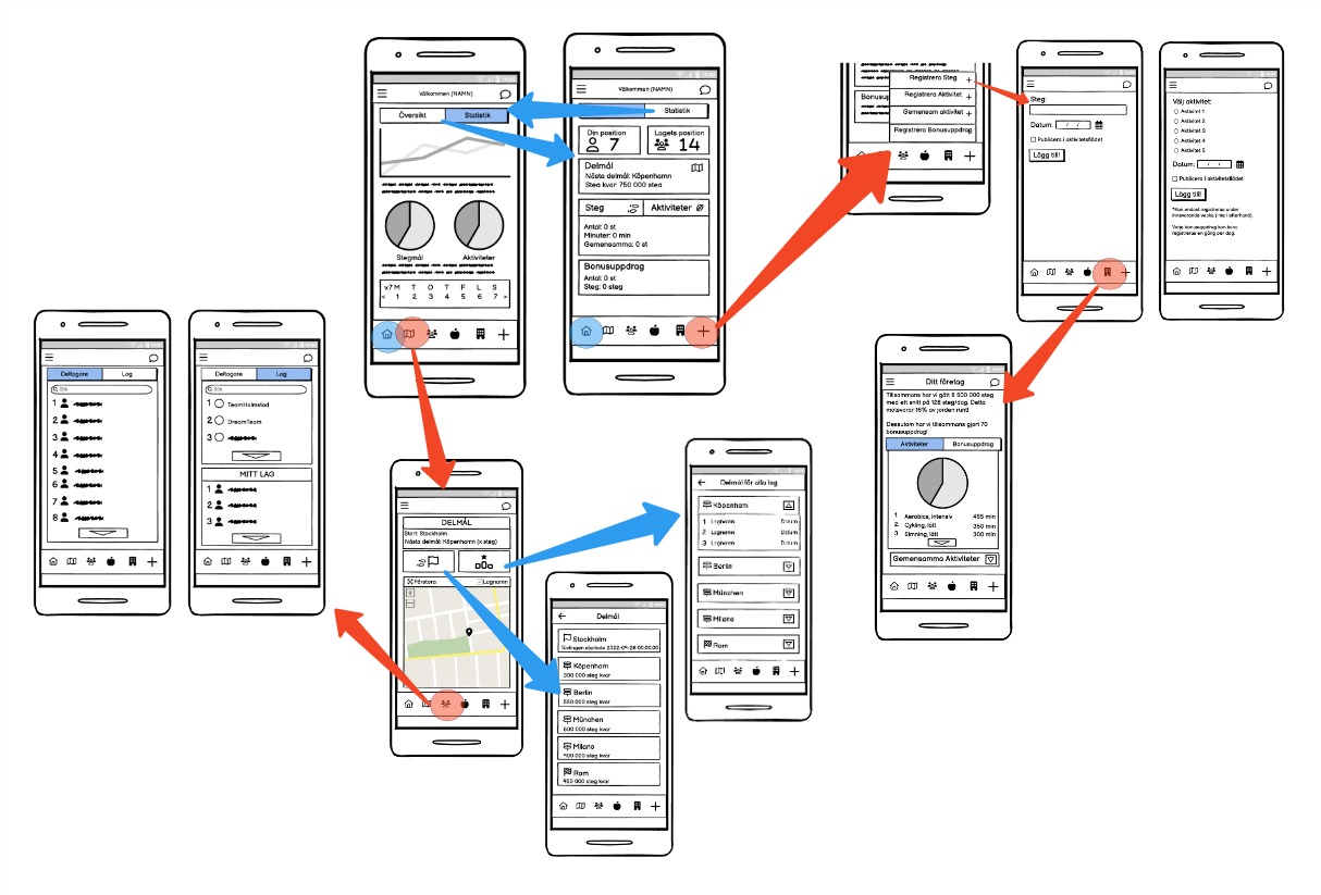
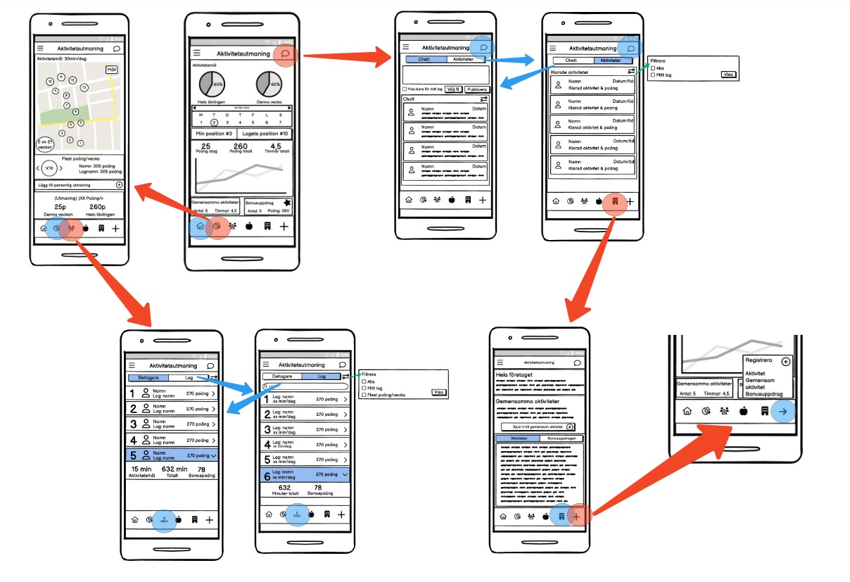
With the structure in place, we moved into sketches and wireframes. The first versions were simple boxes showing how a user might move from one challenge to another. We tested these early to see if people understood the logic before adding detail.
As Evaluation Lead, I planned the usability sessions and focused on how users interpreted labels, icons, and transitions. Watching them use the prototype revealed small but important moments of hesitation that we later fixed through clearer hierarchy and better sign posting.
When the navigation finally felt natural, we moved into high-fidelity design inFigma. We kept Wellstep’s visual identity but gave it more balance and rhythm, typography that breathed, spacing that guided the eye, and a colour palette that both matched Wellstep`s website, which the client had requested and encouraged focus rather than distraction.
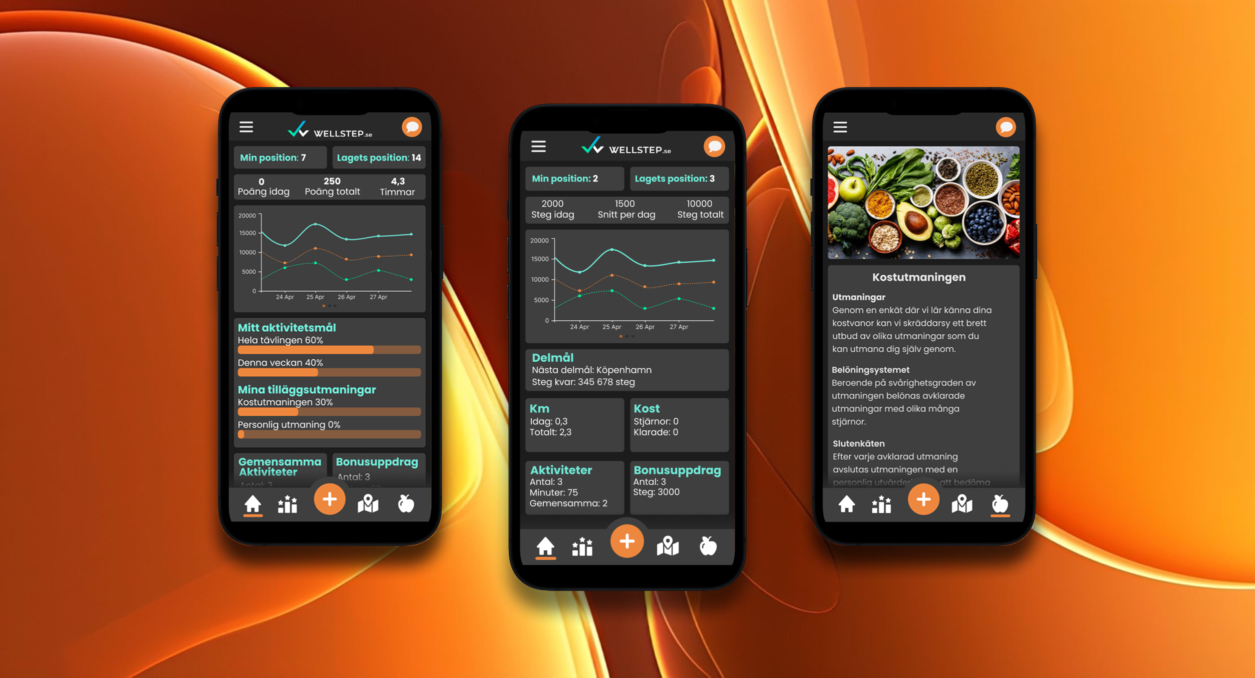
The final concept
The redesigned experience brought everything together. The new Nutrition Challenge offered daily tasks, progress tracking, and gentle feedback that tied directly to existing goals. Navigation was simplified and used the same patterns everywhere, making the entire app easier to learn and remember.
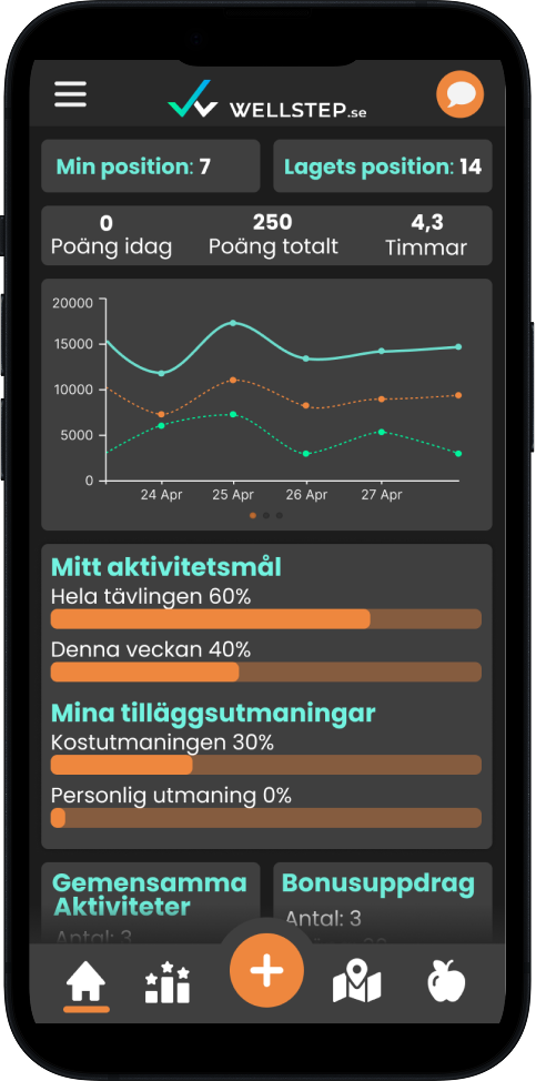
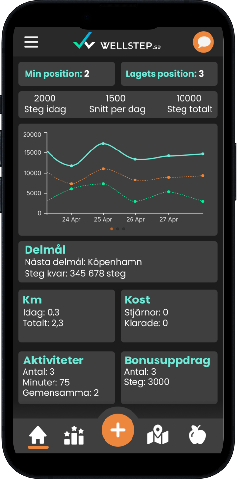
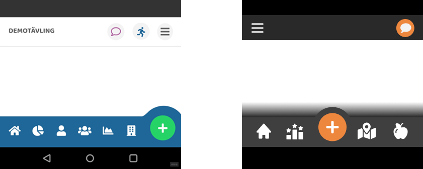
Navigation before
Navigation after
Final Concept - Activity Challenge and Step Competition Landing Pages

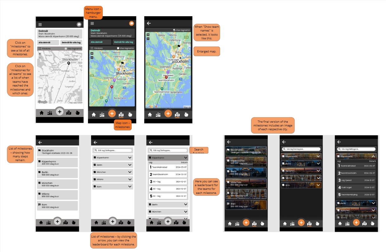
Final Concept – Step Challenge Milestones
Final Concept - Landing Page for Nutrition Challenge

During testing, users navigated faster and described the new interface as calmer and more connected. They stopped thinking about how to learn the navigation and instead focused on completing the challenges.
Outcome and impact
Our final prototype showed how Wellstep’s platform could grow without becoming complicated. It provided a clearer structure, a more coherent interface, and an experience that supported engagement rather than interrupting it.
While the idea of a unified account and seamless challenge switching was part of the concept, it was not implemented in the prototype itself. The focus of the project was on designing the individual challenge experiences and the shared structure that would support this integration in future iterations.
Although our work was conceptual, several ideas were later adopted in the real product. The company launched the Nutrition Challenge and introduced a coherent navigation system inspired by our proposal. For users, it meant smoother transitions and fewer barriers. For Wellstep, it meant a scalable design foundation they could keep building on.
Reflection
Leading the evaluation process reminded me that good design decisions come from seeing how people actually use a product, not from guessing what they need. Working within technical constraints forced us to prioritise and simplify. In the end, that restraint made the solution stronger. The project reinforced a simple truth: when the structure makes sense, everything else falls into place.