Improving the user experience and sales for Oican´s e-commerce site
Project type: UX/UI Redesign, Internship
Project year: 2025
Project role: Mostly independant
Client: Oican Wear
Note: The original Oican webshop is in Swedish. All descriptions, explanations, and case study content below are provided in English.
Methods
- Expert review
- Survey
Tools
- Figma
- Miro
- Shopify
- Hotjar
Background
As a part of my internshipat Oican I participated in a UX design project. Oican is an innovative company developing hats with built-in shock-absorbing protection,combining safety, functionality, and style in everyday life. The goal was to improve Oican´s e-commerce website by identifying and removing potential painpoints, creating consistency and enhancing the overall shopping experience and increase sales for the company.
I led the projectas the only designer, working closely with Oican’s CEO and developers. It was afun, challenging, and a valuable experience that gave me a deeper understanding of both the design process and collaboration in a startup environment.
Expert review
Grounded in Oican’s goals, brand expression, and target audiences, I conducted an expert review of the Oican Wear webshop, starting with desktop and then comparing it to mobile. I evaluated consistency, navigation, and layout, mapping areas where users might encounter friction or confusion. The analysis combined heuristic evaluation, visual review, and hands-on testing of the shopping flow, guided by three principles to drive conversion: clarity, trust, and simplicity.
Key Insights:
Fragmented UI from inconsistent typography, buttons, icons, and colors. Overloaded navigationpages, and on mobile the menu obscured content and didn’t auto-close. Promotions were easy to miss. Shop and product pages had unclear or duplicated information, inconsistent size/color selectors, and weak sale badges. Supporting pages lacked structure. Cart and checkout missed upsells, underplayed discounts, and used a cluttered single-step flow. Footer language and chat were easy to overlook.
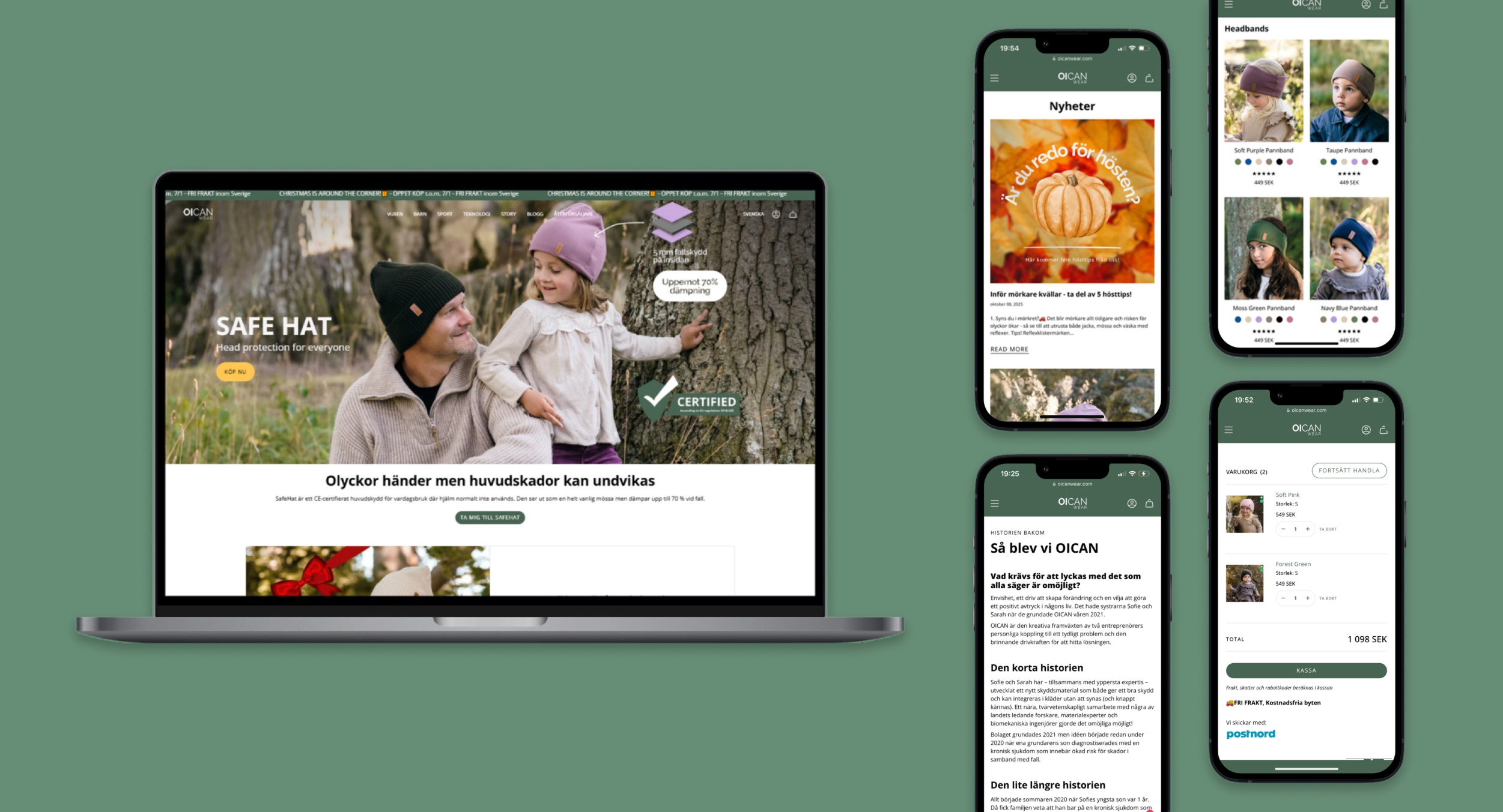
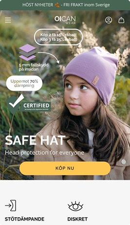
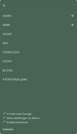
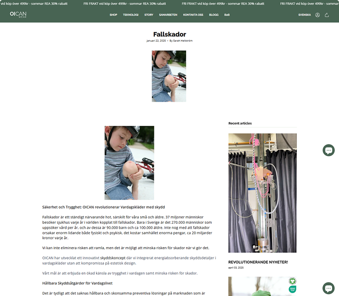
The current webshop


User survey
After an independent expert review, I created a survey for Oican’s actual customers to capture their opinions and experiences. The data showed that customers thought it was easy to navigate through the website and easy to find the right product categories. The data also showed that they think it is a bit hard to find information about a specific product and that the product information always isn´t the easiest to understand. Some respondents also said that the checkout flow is a bit messy.
User behaviour analysis
While the survey was out to gather user insights, I conducted an analysis of user behavior with a tool called Hotjar. A tool I had never tested before but which Oican had used to see how their visitors behaved on the website.
Hotjar provided data about such things as dead clicks, U-turns, rage clicks, short recordings on users, scroll depth and much more.
Key findings from the analysis:
- 80% of the users used there mobile to browse on the website
- 41% dead clicks on non-interactive areas
- A lot of users were stuck at the homepage for a long time
- Low scroll depth, around 40–45%, key info below the fold is missed, especially on the mobile verison
- Frequent U-turns between kids collection and product pages
- A lot of the call to action buttons were placed below the flod and could get missed
From this, I understood that we need to focus strongly on the mobile version, ensure that non-interactive areas clearly appear non-interactive, and move key buttons and information above the fold. This could also explain the quick U-turns from the Kids product page back to the Kids Collection. I understood there was a need for guidance since a lot of users were stuck at the same place. I also had a strong belive that these improvments could increase the sales for Oican.
Design improvements
Grounded in user behaviour from Hotjar, survey insights, and the expert review, the redesign focused on removing friction, increasing clarity, and guiding users more naturally through the shopping flow.
1. Surfacing key actions above the fold
Hotjar showed that most users only scrolled 40–45%. This meant important actions and information could risk never being seen. I therefore reorganized all key pages so essential content (CTAs, product highlights, navigation shortcuts) appears immediately on the mobile version.
2. A clearer, more structured product page
Users reported in the survey that product information was hard to find and understand. Behaviour recordings also showed frequent U-turns between collection and product pages. I fixed the structure on the product page so users instantly see the essentials, and reorganized descriptions, size info, and care instructions into a cleaner, scannable layout. This helps users make informed decisions without searching or scrolling.
3. Making interactions predictable
Many of all clicks were on non-interactive elements, which showed a clear sign of visual ambiguity. Clickable elements were redesigned with consistent affordances, while non-interactive elements were simplified and made "flatter". This reduces confusion and creates a more intuitive, trustworthy interface.
4. A smoother add-to-cart experience
Recordings showed users being redirected to the cart and immediately returning, breaking their flow. We replaced the redirect with a confirmation popup, allowing users to continue browsing without interruption. This aligns with modern e-commerce patterns and supports multi-product shopping.
Together these changes were made to directly address observed user behaviours, not assumptions. By elevating crucial content, clarifying information, creating structure, reducing misclicks, and preserving user flow, the redesign creates a more intuitive, mobile-first shopping experience that supports both user needs and Oican’s sales goals.
Impact...
One month after the initial Hotjar analysis, I re-evaluated user behaviour validate whether the changes actually reduced friction and improved user guidance.
What improved compared to the first analysis:
Clicks became more “intentional” on the product page
Instead of scattered clicking across many areas, the product page heatmap showed a more concentrated click pattern around the key product section. This suggests that the structure and visual affordances became clearer, and that users more quickly understand where to interact.
Less visual ambiguity in interactions
Previously, many clicks landed on non-interactive areas. In the follow-up, the click behaviour looked more aligned with interactive elements, indicating that clickable vs non-clickable is now communicated more consistently through the website.
Above-the-fold prioritization was validated
Scroll data still showed a sharp drop after the top section (many users don’t reach mid-page). This reinforced the design decision to keep key actions and essential information visible immediately, especially on mobile.
What this tells me:
The follow-up data supports that the redesign improved clarity and predictability. Especially on product pages and that above-the-fold content remains critical for conversion. If I were to still work on improving Oicans website I would keep iterating based on where users still drop off, and to track key behaviours over time.
Reflection and key learnings
This project reinforced how important it is to balance user needs, business goals, and technical constraints. Hotjar helped me move from “what I think users do” to “what users actually do,” and it pushed me to design with fewer assumptions and more evidence. I also learned the value of iteration: shipping improvements, validating them, and being comfortable with refining the solution rather than aiming for perfection in one round.
Key takeaways:
Data beats guesses: Surveys told me why users struggled, and Hotjar showed where they got stuck. Using both made me understand better and my decisions became stronger.
Mobile first matters: Since many users don’t scroll far, the top of the page has to do most of the work.
Clear UI builds trust: Reducing dead clicks wasn’t just polish, it made the site feel more predictable and easier to use.
Small changes can help a lot: Better product structure and a smoother add-to-cart flow can reduce hesitation and keep users moving.
Iteration is key: I made changes, then checked behaviour again to see what improved and what to refine next.

